 Below is the similar (anamorphose) map for 1950 and 2025, as projected in 1993
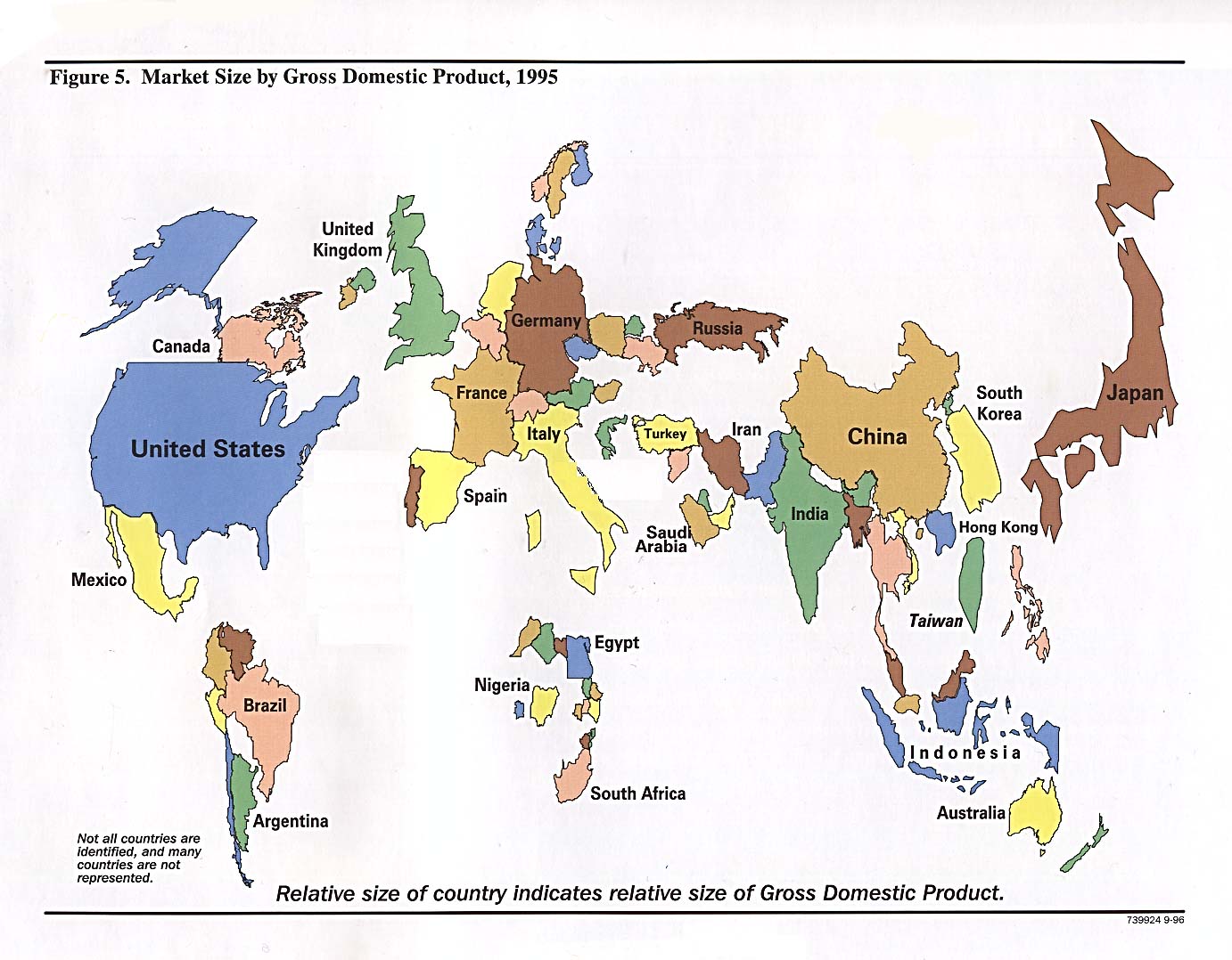
Here is one scaled by wealth (GDP in PPP, 1995 data), note China and Russia grew a lot in the past 10 years

This is the same map using exchange-rate converted GDP (perhaps with slightly older data as well): Color denotes income: yellw=highest, green=lowest.

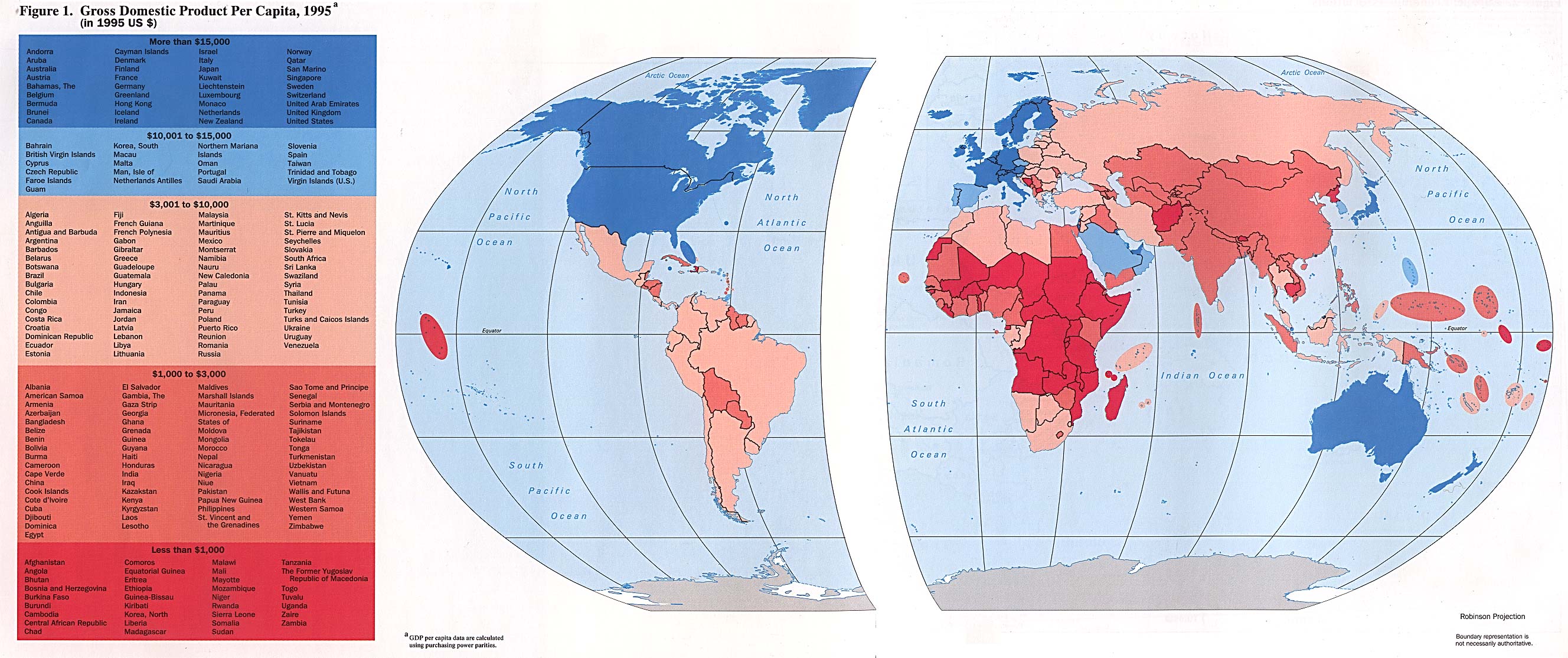
GDP/cap 1995 by PPP
GDP density (US$/km2) is a guide for real estate speculators.

Share of service in GDP shows strong correlation to GDP/cap (note India has higher service content than China, due to the IT/outsourcing industry)

Future trend: GDP/cap growth (1990-2001)

More population sized maps, population scaled flags

Simple square shape, population scaled

Shape preserving, pop-scaled

Square shaped GNP map, 2000

6 comments:
also check out this site, via asiapundit.
Great blog. I enjoyed visiting it.
Fascinating maps, and really enjoyed the arguments about China's growth in GDP per capita and whether/when it will overtake US's.
Economic Population Regional Map of World.
http://img338.imageshack.us/img338/9129/economicgroupsri3db5.png
I had the idea of making what is called here the population scaled map about a half year ago. I got stuck. The I tried a simpler project of making a pop-scaled map of the U.S. states, and I was able to do it. It was pretty hard, but I did it. Now I see these here, nice stuff; good job. Darrell
Very interesting page you've got here.
Post a Comment